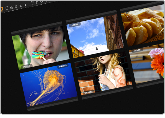
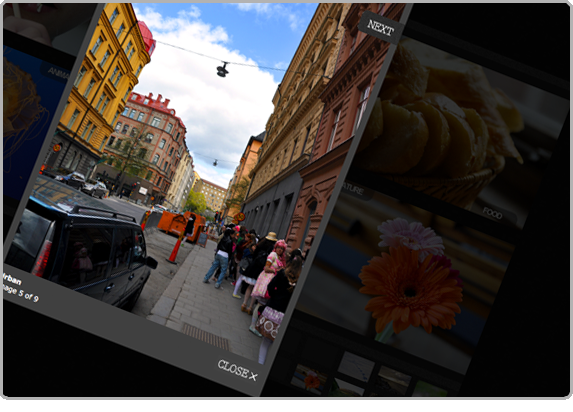
Photography can speak for itself. And Kersti Wallstedt didn't want her work to have to shout over the noise of a cluttered website. In fact, she asked that all content be contained to two pages: a gallery, and a single personal information and contact page.
Simple and clean was the goal of this project, which meant that it was my job to give the site a professional flare without resorting to any unnecessary flourishes. Each part in the finished product had to have a purpose, while simultaneously unifying the galleries with strong secondary design characteristics. Elements had to appear an disappear as needed, to keep the viewing experience as uncomplicated as possible. At the same time, I wanted to make it clear that this was no template but a cohesively thought-through whole.
For the color scheme, I decided to make the site black and white and seek bright, complementary colors in the photos themselves. From the gallery headers to Kersti's self-portrait on the contact page, it's the pictures that make this site pop. I think that's how it should be.
Other Projects
 richard solomon, art rep |
 cesia photography |
 trannequin! the musical |
 idalia solar tech |
 live & in plastic |
 meredith crandell |


